Image Of The Month - September 2001
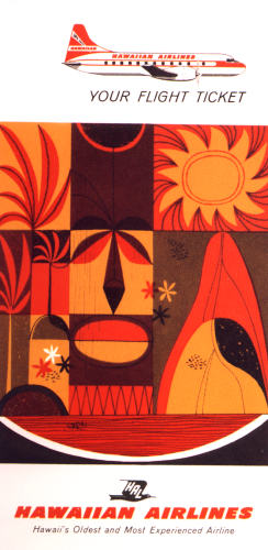
Hawaiian Air Flight Ticket Sleeve, 1955
Wow, isn't this great? This ticket sleeve is a perfect example of the kind of individualistic enthusiasm that you often see from companies in the 50s, showing a willingness to use playful stylized imagery in conjunction with the corporate identity. Even for the smallest things, there's such a clear difference between the kind of artisanship and unique identity that commercial institutions tried to convey in mid-century America, as compared to now. Don't get me wrong, there are plenty of counterexamples today, so I'm not one of those negative-niks. But even just a cursory sampling of mid-century swag reveals a considerably stronger effort to make an individual or bold statement as a way to attract people, versus the bland ideal that seems to get so much more encouragement now. Look at housing, hotels, apartments, stores, restaurants, the travel industry, automotive design, electronics, ... the list goes on and on. Most cities have tons of neat buildings in their regular commercial districts that were originally built to make a STATEMENT and go out on a limb to appeal to an esthetic, even if it wasn't an esthetic that was gauged to match the fancy of the maximum number of consumers. But what is the increasingly typical fate of these kinds of buildings today? The bulldozer, followed by new construction of buildings that are so bland you'll hardly notice them. And that's exactly the aim of the designers! But at least there are still remnants here and there like the ticket sleeve above, reminding us of a time when unique design was a mainstream ideal! OK, I know it's practically just some doodling on a sleeve, and Hawaiian Air was pretty small then, since Hawaii wasn't even a state yet, but anyway that's what it makes me think of.